Apple Is Rethinking Safari's Cramped Corner on the iPhone Duo's Outer Screen
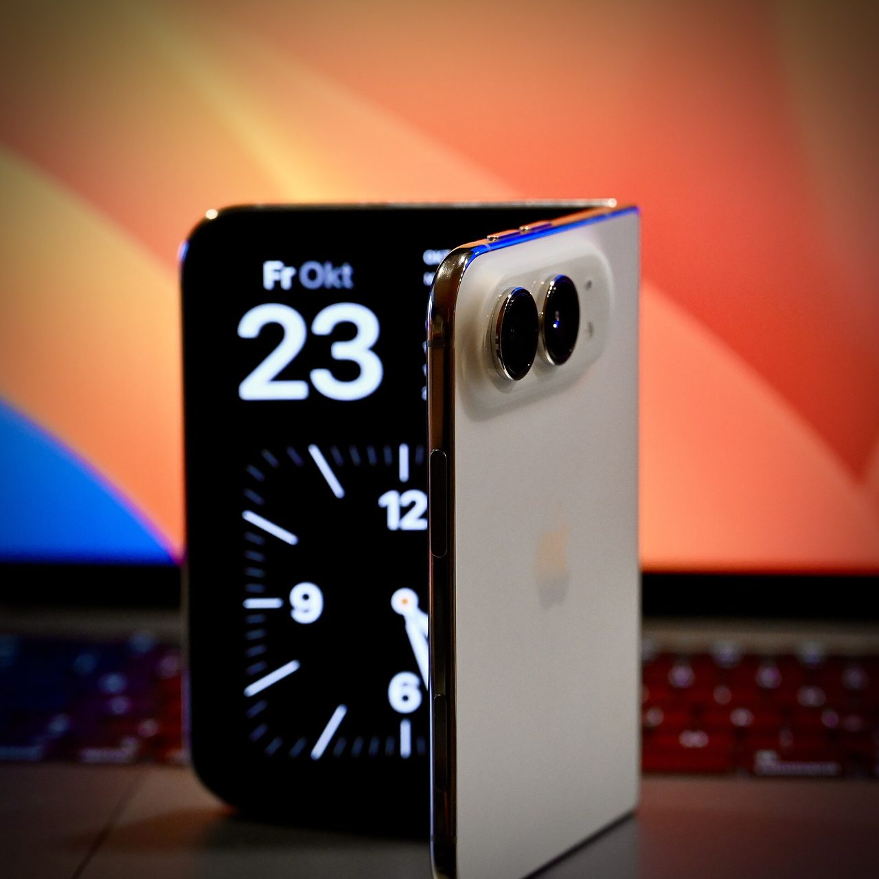
Photo: SimonWaldherr / CC BY 4.0 · via Wikimedia Commons
Apple Is Rethinking Safari's Cramped Corner on the iPhone Duo's Outer Screen
Reviews agree: the outer display strangles web pages
Apple's first foldable iPhone, the iPhone Duo, reached stores on October 23, 2026, pairing a 5.4-inch outer display with a 7.6-inch inner one. Early reviews converged on the same complaint: Safari lines its controls along the side of the narrow outer screen, leaving websites a squeezed column. Chance Miller of 9to5Mac summed it up in his October 21 review, writing that the web simply is not optimized for this form factor.
Apple admits the problem and asks developers for ideas
On October 23, WebKit engineer Jen Simmons confirmed in the post "WebKit Features for Safari 27.1" that Apple is exploring ways to let websites make better use of the outer display. She invited developers to share proposals, while cautioning that no approach has been settled and no timeline announced.
The quick fix exists, but most sites would break under it
Simmons pointed to the existing viewport-fit="cover" setting, which lets a page extend beneath browser chrome. Apple's research found that many sites fail to keep important content clear of system controls on all four screen edges, so flipping that switch globally could bury content under buttons.
One candidate: stretch the title bar, keep buttons safe
Among the options under study is extending a page's title-bar background across the full screen while keeping navigation buttons in positions where nothing covers them. It would recover width lost to the side-mounted controls without stranding content underneath. For now it is an idea, not a committed change.
Fold it like a book and PDFs go two-up
Safari 27.1, shipped the same day the Duo launched, already includes one user-visible foldable touch: hold the phone half-folded like a book while viewing a web PDF and it renders two pages side by side, reverting to a single page when the screen is flattened or closed.
Two preview APIs let pages sense the fold
For developers, Safari 27.1 on the Duo previews the Device Posture API, which reports folded versus continuous posture through a CSS media query and navigator.devicePosture, and the Viewport Segments API, which describes the areas on either side of the crease via media queries, six environment variables, and window.viewport.segments. Both sit behind feature flags under Settings, Apps, Safari, Advanced, Feature Flags.
Cover-screen users still squeezed, developers wait
Anyone who mostly uses the phone shut will keep seeing boxed-in pages until Apple ships a fix; unfolding remains the practical workaround. Web teams face a wait-and-see: forcing full-bleed layouts today risks breakage across sites that never budgeted safe areas, so experimenting with the preview APIs is the safer bet.
Apple's proportion-first approach awaits proof
The Verge's review framed the philosophical split: Samsung lets content fill the cover screen's full width, while Apple reserves a control strip to preserve its vertical proportions. Whether software refinement can vindicate Apple's choice is now the open question hanging over its $1,999 foldable.
Sources
- MacRumors: Apple Wants to Fix Safari's Cramped Layout on iPhone Duo
- 9to5Mac: Apple exploring fix for Safari’s cramped layout on the iPhone Duo’s outer display
- WebKit: WebKit Features for Safari 27.1
- The Mac Observer: Apple Investigates A Fix For The Narrow Safari Layout On iPhone Duo
- DigitBin: iPhone Duo Safari: Apple Studies Outer Display Layout Fix